The Opportunity
Flight Centre, Australia’ biggest travel agency, had a relatively new app and was doing what they are well known for – selling cheap flights, and lots of them! However, Flight Centre is also known for its amazing customer service and the knowledge of their consultants, known as Travel Experts.
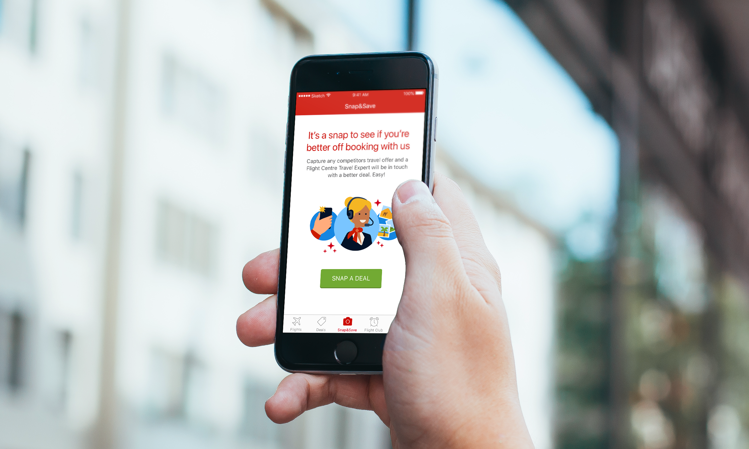
The Flight Centre app’s new Enquiry Builder feature brought the Travel Experts into the app in a fun, interactive way. The Enquiry Builder (working title, Snap&Save) encouraged potential customers to see if they were better off booking with Flight Centre by sending a photo of a competitor’s travel deal to a a Travel Expert, which they would ‘better’ or add value to in some way (e.g. make the holiday cheaper, offer a better quality hotel, add airport transfers etc).
My role was to design the user experience and UI that was intuitive, as native-as-possible, as well as fit with Flight Centre’s existing branding.
The Approach
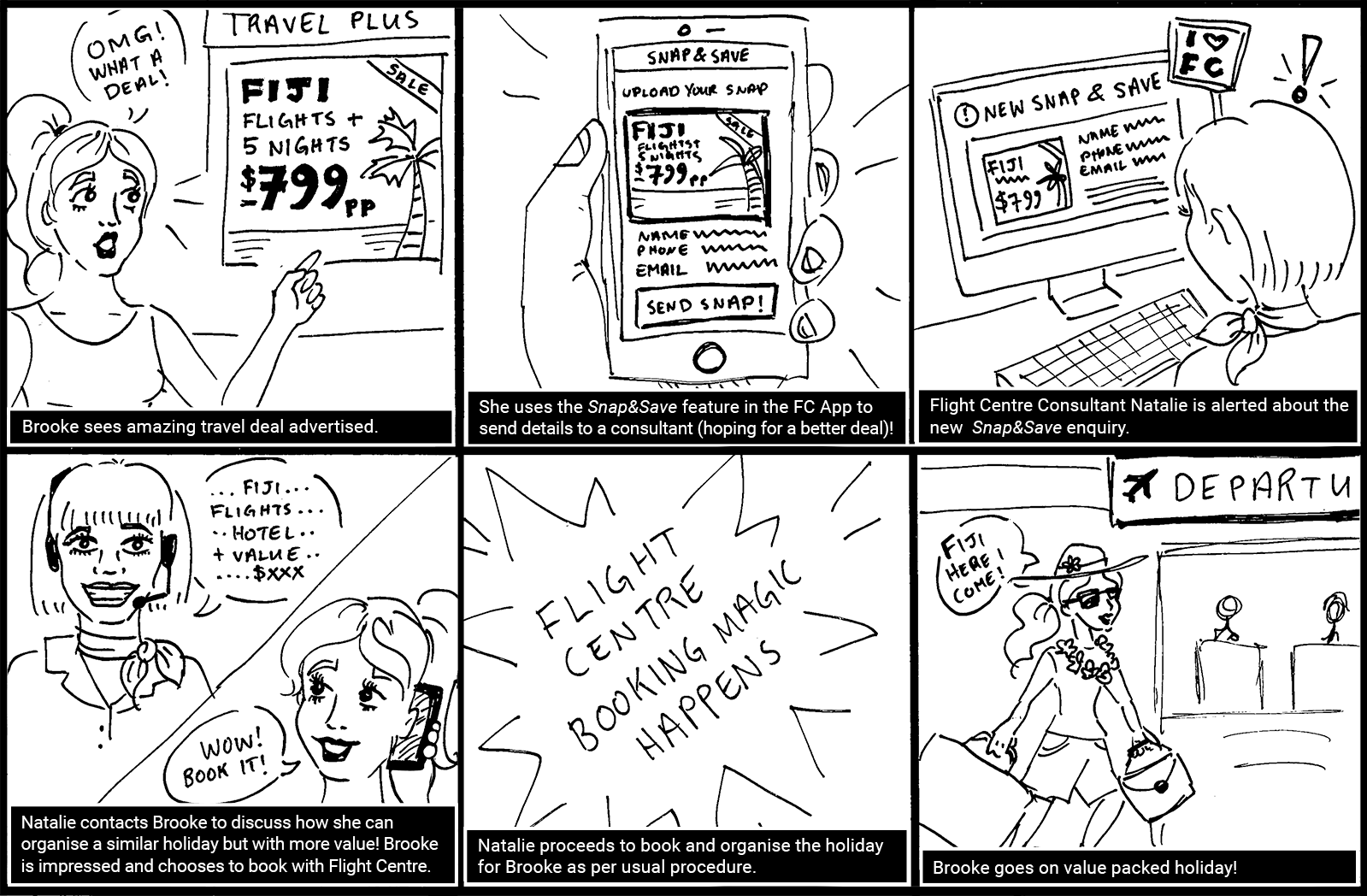
Storyboarding
As part of the UX design process, I created a storyboard to communicate why and how Snap&Save could be used. This was a useful tool to remind myself and the team of the feature’s intended use and the likely context it would be used. It also highlighted that the value of the interaction comes from offline – when the user is connected with a friendly, knowledgeable Travel Expert who can not only better the snapped deal, but do so with excellent service.
The storyboard was also used to help communicate the product to management before visuals were created.
Wireframing Solutions
Wireframes were created to communicate the user flow through Snap&Save. The wireframes were iterated throughout the design process to define and redefine a feasible Minimum Viable Product (MVP). Concepts which were also explored in the first wireframing phase (but did not make it into the MVP) were onboarding flows for first time users and storing snaps for reference.

The Outcome
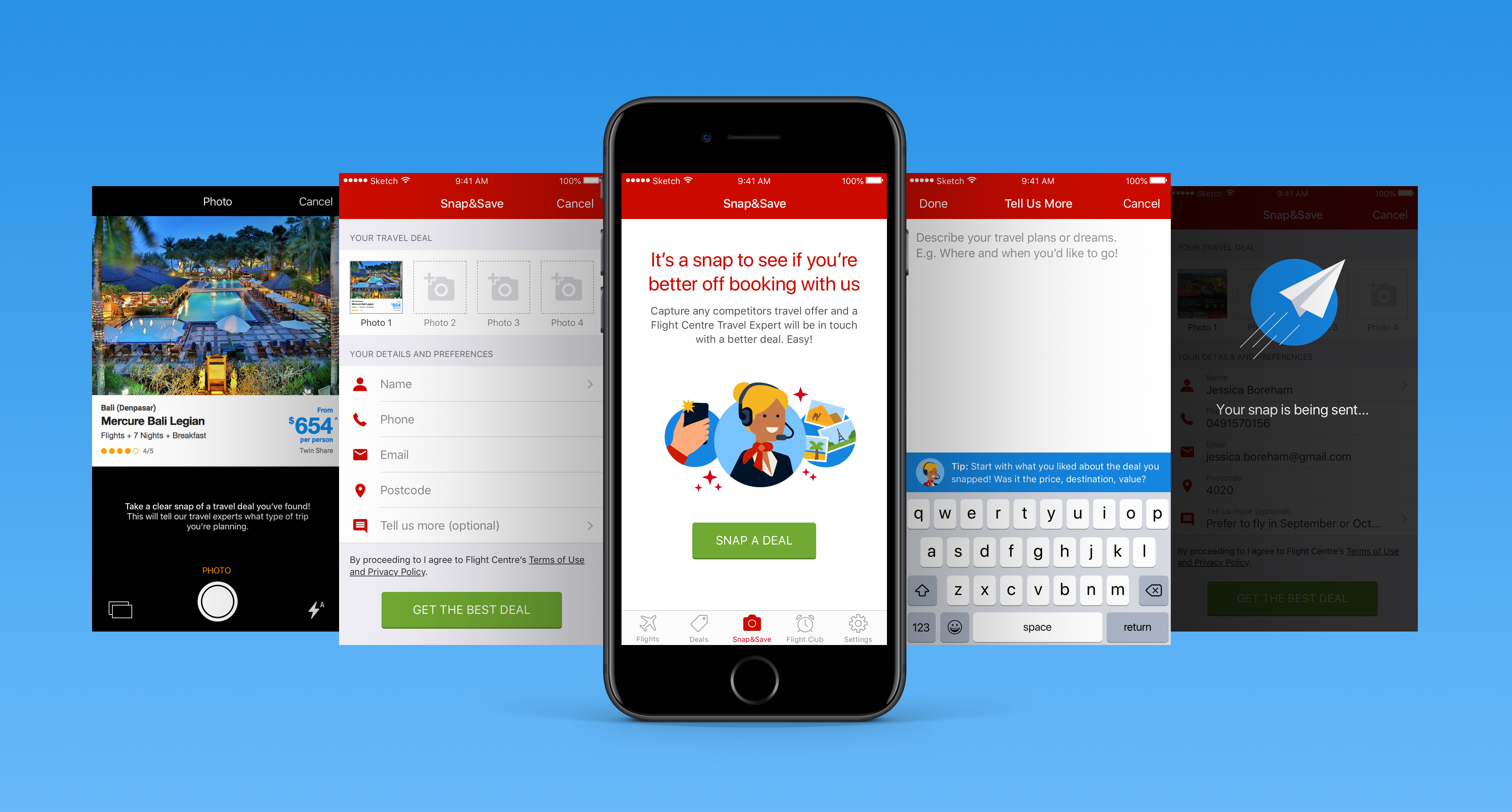
Clean UI with a native touch
Like the rest of the Flight Centre app,Snap&Save adhered to the native visual languages and experiences of Material (for Android device users) and Apple’s Human Interface Guidelines (from iOS device users). This meant that two interfaces were designed , keeping in mind the different ways each native system presented information or an experience. We budgeted in moments to build brand character and delight. For example, a consultant message prompting hints in the”Tell Us More” form field, or the loading message after the form was submitted.

Epilogue
Like many products, the Enquiry Builder did not get a chance to stay as Snap&Save. With a few sprints to go until the Snap&Save MVP was due for release, Upper Management made the decision to rebrand the concept as ‘Genie,’ with the idea that your ‘travel wish’ would be granted by a consultant/genie. Like all agile teams would do, we pivoted to accommodate the new direction with the remaining resources we had. I however, believe the original concept to be in stronger alignment with the Flight Centre brand and then app roadmap.
